
There are heraldry aspects that are basically in a nutshell that is pick from column A, pick from column B, things mix together and everyone’s happy and there are no conflicts and all goes smooth. Then there are those that one part or another doesn’t mix well at all, and it’s a manner of hand holding, leading in the right direction, and working toward the mutual goal.
Then there are submissions that take a bit of work on both the submitter, and the herald, and a prayer through the college of heralds, to get through. Are these difficult or wrong? Not at all. They are just harder to get through at first.
First and foremost is my deputy, her name of Muireen Ban, is a simple Irish name and easy to document. The trick is was her device. At first she wished to have a Pall, with a triskelion with three different colors. Mind you this has a lesson in learning conflict checking. See what I never realized and should of known right off the bat is that with a Kingdom called Trimaris I should of foresaw what the primary focus of heraldry that they have,?!?!?! Oh yea you guessed it.
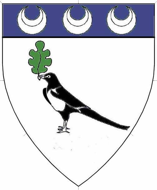
So we went to the drawing board with her device. During the time frame, I will say she has been one of the most caring, most wonderful, and most helpful people in my house hold. She has adopted the Magpie within this time frame (or beforehand I honestly cannot remember) so when the Letter of Decision from Kingdom arrived I asked her if she minded that I came up with an idea. My idea? Well I am glad you asked. I took the Magpie idea, a charge from our household, and her idea of an element of my own device (which many are starting to develop as part of the family dynamic we are starting) and came up with something that she loved.
“Argent a magpie maintaining an oakleaf proper, on a chief azure three crecents argent”
Next was again not a headache by any sorts, however just a bit of finding the right combination with the client’s wish and what I can do as a herald. Sigrida Arnadottir is a wonderful and easy to put together Norse Name and here is again another example of making the wish of what she is looking for, work so when the college of heralds sees it, they will look at it, and register it, and if you wish a slight artistic license then feel free to do so.
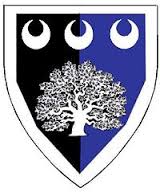
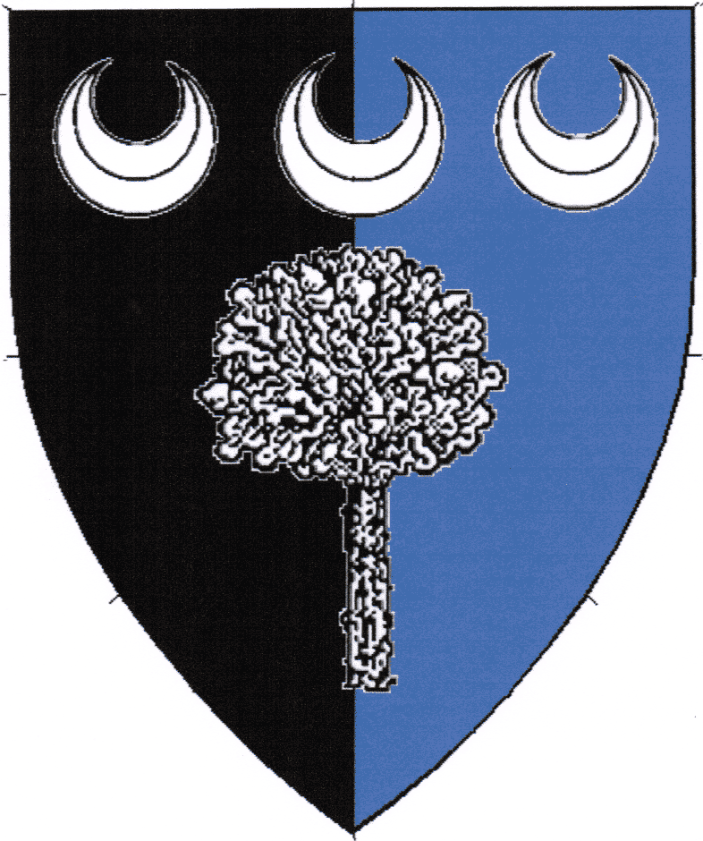
Now with that said, let me describe what I mean by artistic license. What artistic license is id doing an alteration on the visual representation of your device that you would like, at the same time does not change anything within your device all together? For example, with my device, when I originally submitted the device I have an idea of how I wished for my device. Come to find out there was either some confusion of the tree looking like a bush, and it being a heraldic oak tree to begin with. So I allowed the college to make a change to help make the device go through, at the same time knowing that change can be done afterwards as artistic license. (see below, the one on the left was my original idea, the one on the right, is the college. That is a form of artistic license)
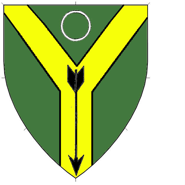
So with Sigrida, what she has in mind is a green background, a Per Pal in gold, either an eye in blue, or a annulet in silver (this is still a work in progress) and an arrow rune. Runes in itself has been done, however that style is one of those that the college cannot document, and will have difficult registering. The work around this, is to make it an arrow and when registered if she wishes to make the arrow in form of a rune, that becomes artistic license.
So we have either
Vert on a pall Or an arrow sable, in chief an eye argent irised azure
or
Vert on a pall Or an arrow sable, in chief an annulet argent

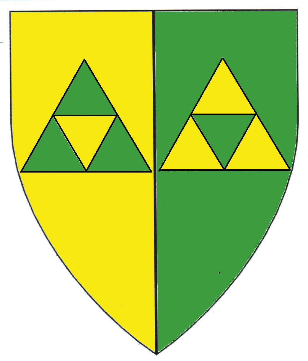
This next one is one I really hope goes through without a hitch. Magnús Surtsson was another easy done up Norse name that I love putting together. The trick is with his device. Particularly the two triangles voided of triangles inverted, in his device for one. The triangles in question have been proven to exist as period heraldry. That is not the question, you combine this style of design with a green back ground and gold triangles and you get really close to the Legend of Zelda fame. Granted with the ones I have seen go through before, I find this design nowhere close to the “triforce” if you will. And I am constantly looking at my emails that come in, and seeing where the letters fall to see how this progresses.
Fingers crossed for you Magnus.
Per pale Or and vert two triangles voided of triangles inverted counterchanged.
Till next time, yours in service
Conall an Doire
